JamBar
responsive website and native app of an accessible concert venue
This project was created while taking Google UX Design Course on Coursera using Figma that utilized the user centered design process to help conceptualize and develop a concert venue app and responsive website for differently abled users.

Introduction
JamBar is an intimate concert venue and restaurant. Rather than go through third party sellers, this app and responsive website provides users seamless ticket purchasing from start to finish.
The problem
Differently abled users and temporarily differently abled users have difficulty finding and selecting accessible seating at concert venues.
Role
UX Designer from conception to delivery
Duration
Oct 2021 - May 2022
The Goal
Maintain accommodation tickets at the forefront for differently abled users by displaying an accessibility feature with detailed seating info and a variety of accommodation ticket types.
Empathy
To ensure that my app would be useful in the real world and gain insight on what concert goers were lacking in their ticket purchasing experience I conducted interviews with five participants and created two personas from two main key groups. One primary group were older adults who have trouble finding seats that accommodate their specific needs. And the other group were young professionals who were concerned about safety. Although both group’s needs are different, they converge on needed accommodation seating. Overall this user research revealed three pain points.
User pain points
lack of
ADA availability
lack of security visibilty
vagueness of items permitted
I developed the persona, Maria for the primary key group of older adults and Josie for the young professionals.
Personas

Maria, 47
Elementary School Teacher
Goals
-
To enjoy free time with her daughter
-
To help her students learn new creative concepts through music
Frustrations
-
"I can't stand too long so I need a place to sit."
-
"Sometimes there is not enough ADA spaces at venues."
lives with daughter
Meet Maria
Maria is a creative educator who loves teaching her young students concepts through music She is also a single mom who cherishes time with her daughter by attending concerts. Although due to her bad knees, she can’t stand for too long so she enjoys sitting towards the back of a venue while enjoying a meal. Although, ADA sitting availability can be lacking at certain venues.
"Concerts are relaxing, I like to attend with my daughter but sometimes there is limited handicap availability. ” - Maria
Meet Josie
Josie is a talented young women with a hectic professional life. On weekends she tries her best to go to different local events happening around her hometown. She attends concerts on her free time because she loves the live experience and being in the front row. She has recently broken ankle but still really wants to see this particular musician because they don't tour often.

Josie, 25
Social Worker
Goals
-
To balance her work and social life
-
To attend a live concert when favorite musician is in town
Frustrations
-
"On certain apps I can't see if there is seating or not."
-
"Sometimes I don't know what I am allowed to bring to a venue."
1 dog
"I think concerts are electric, although I am unsure if I can go to a live show with my broken ankle. ” - Josie
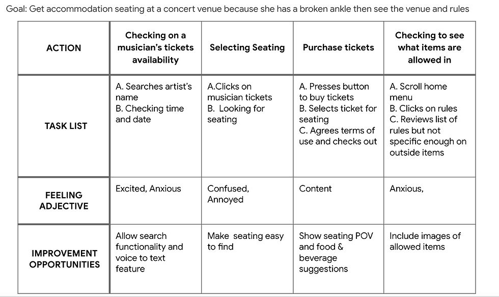
Below I mapped out how Josie and Maria would navigate a standard concert venue app through a user journey map.


I also created the overall user flow keeping my personas in mind.

Define
To ensure that I am putting the user first upon conception of this app, I developed a problem statement focusing on Maria and Josie's needs
Maria is an active elementary school teacher and mom with bad knees who needs easy accessible seating access during live events at venues because she wants to be comfortable while spending time with her daughter.
Josie is a young professional that loves spending time with her friends who needs to feel safe and aware when attending events at music venues because she has a broken ankle but still wants to attend a live show.
Ideate
In order to understand how my mobile app could stand out in the market I completed a competitive audit and competitive audit report. I compared the customer service and booking ticket experience of three different competitors. Some opportunities I thought to include were providing an accessibility tab in the main menu with a detailed description of how the venue can provide accommodation seating, providing a seat POV image when a purchasing ticket, and a voice to text feature on search navigation.
Which led me to brainstorming different homepage interfaces of the app with pen and paper, I drafted iterations of the home screen. My goal was to present the concert events and dining as well as maintaining accessibility on the home page.
Sketches

Low-Fidelity Prototype


Testing
After completing my low fidelity prototype in Figma I conducted a usability study on five participants. My goal of the study was understand the specific challenges that differently abled users may face when selecting and purchasing accommodation ticket seating. I used conversion rate as my key performance indicator.
I did 2 rounds of usability studies. One with a low fidelity prototype and the other with a high fidelity prototype. Both helped me develop a robust mobile app that balanced between aesthetic and accessibility.
Round 1 Findings
The findings of my first usability studies were:
-
Conversion rate for main user flow 80%
-
Many participants found the navigation bar was too vague
-
Some participants were unsure of term "ADA" and felt a lack of accessibility options
Before Usability Test 1
ADA was unclear
the navigation bar icons too vague

After Usability Test 1
switched term to accommodation
not enough options
added detailed icons and title

more options
Each user was able to complete the main user flow without any hiccups. After compiling insights on on the user's experience, I added additional accessibility options and changed the term ADA to accommodation seating on account some users did not know what that meant.
Round 2 Findings
The findings of my second usability study on my high-fidelity prototype were as follows:
-
Conversion rate for main user flow 100%
-
Some participants disliked that the seating map had too many steps
-
Most users had difficulty with profile page navigation
Before Usability Test 2
some users were confused on where to click on this page

After Usability Test 2
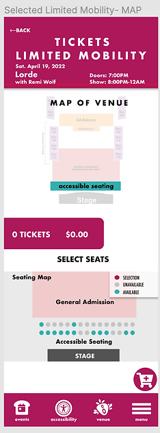
instead I provided the map for users to orient themselves
Before Usability Test 2
poor navigation

After Usability Test 2
added a return feature
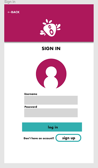
The second study, revealed that seating selection was too many steps preventing one user from completing the main user flow. Thus, I redesigned the seating selection into a single screen. Based on their responses with the profile I added a back button and added a sign up option similar to that of other platforms.
added a sign up feature
The App
After many iterations I completed the JamBar app with a clear main user flow of selecting specific accommodation ticket types, viewing seating selection and providing information on rules and security.
"I like that there are limited mobility seats for me, rather than being lumped into one type of accommodation category.” - participant a
Ideate for Web
Once the JamBar app was completed I started working on designing the responsive website. I used the JamBar native app as the main guide for building the Information Architecture.

Final Mockups of Responsive Web
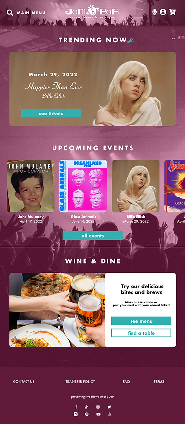
Keeping the 4 c's in mind I maintained consistent aesthetic while also considering the device and its' context. Each offer a different home page experience for the user while remaining complements of each other.
Desktop

Ipad
Mobile

My design choices
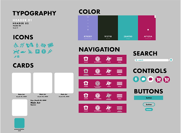
To maintain brand consistency throughout the app I wanted the berry to appear in most user interactions. My goal with the strawberry logo was for it to be fun and playful and appear as though there are speakers blasting from the berry creating "the jam." While a user doesn't have any tickets in their cart, the jam drum acts as a place holder in their profile page. The 'spilled jar' also serves this purpose but in the cart menu pop up. In regards to color, I selected a color palette that was appropriate under WCAG guidelines while also following my berry theme.


JamBar Logo
Header
Jam drum
Spilled Jam

Design system
Next Steps
If more time permitted, I would conduct another round of usability studies to ensure I validated user pain points for differently abled users on accessibility features. I would also have liked to animate the 'jam drum,' for a loading page to enhance the experience of the user as well as add a specific chime for when a user just purchased a ticket.

Key Takeaways
As my first introduction to Figma and designing a mobile app and responsive website on Adobe XD, I learned how to adjust my design for differently abled users. I enjoyed iterating after the usability studies, it made me think about the balance between aesthetics and usability. This project overall made me rethink design choices by putting accessibility in the forefront of designs.
