Celine Craven
musician merchandise responsive website
This project was created while taking Google UX Design Course on Coursera using Adobe XD that utilized the user centered design process to conceptualize, design and test a musician merchandise responsive website.
Role
Duration
Introduction
Celine Craven merchandise website and app showcases size inclusivity, waitlist options and filter and sort functionality - unlike current musician merchandise websites. The typical user is 18 - 30 years old that likes to express themselves through clothing and artwork.
The problem
Current musician merchandise websites don’t have size inclusivity nor do they have sort and filter functionality.
UX Designer from conception to delivery
March 2022 - May 2022
The Goal
The goal is for users to feel empowered through Celine’s merchandise by viewing merchandise on bigger bodies, having control through sort and filter functionality and providing the opportunity to join a waitlist for items that are sold out.
Empathy
To gain insight on user's pain points on available merchandise websites I conducted interviews and developed a persona through empathy maps based on the qualitative data of one main key group. The main key group were young artistic adults who like to express themselves through apparel and music. I found that users that don’t find their size in clothing feel insecure and lose interest in continuing their online shopping.
My research also revealed that seeing items that are sold out but are not explicitly clear on availability frustrates users. Thus revealing the two main pain points: size exclusivity and sold out items appearing as available.
User pain points
size exclusivity
sold out items appear available
Persona

Dawn, 28
Ticket box office
Goals
-
To find clothes online in a wide range of sizes
-
To purchase unique and collectable affordable items
Frustrations
-
"I feel insecure when don't offer clothes in my size."
-
"I wish items would not sell out so quickly."
1 cat
Meet Dawn
Dawn is an artistic young woman who loves music. She works at a ticket box office for her local theatre company. For fun she enjoys attending live music shows, listening or discovering new artists. She likes to wear favorite musician’s apparel to express her music taste. Unfortunately, some of her preferred clothing choices are not in her size which makes her feel insecure.
“I like purchasing affordable unique merchandise from my favorite musician”
- Dawn
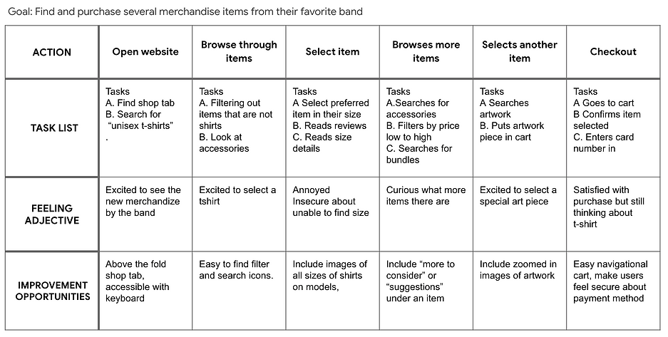
Below I mapped out how Dawn would navigate a merchandise website or app with a user journey map.
Dawn's journey map
Define
I developed a problem statement focusing on Dawn's needs to keep my user at the forefront of my designs.
Dawn is an artistic young woman that loves music and fashion who needs affordable and a wider range of size selection when searching for her favorite band’s apparel because she wants to be able to express herself through art and clothing.
Ideate
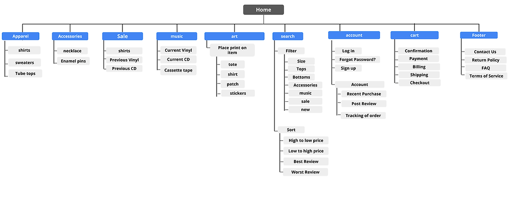
To see how my responsive website could stand out in the market I completed a competitive audit and competitive audit report. I compared the browsing and ordering process of three different competitors. Some opportunities I thought to include were showing differently sized models, sort and filter capability, a review section and a voice to text feature in the search bar. After conducting this research I built the information architecture (IA) of the site. The IA I chose is familiar to other musician merchandise websites while including familiar large warehouse website's sort and filter functionality. My goal was for the user to feel in control.
.png)
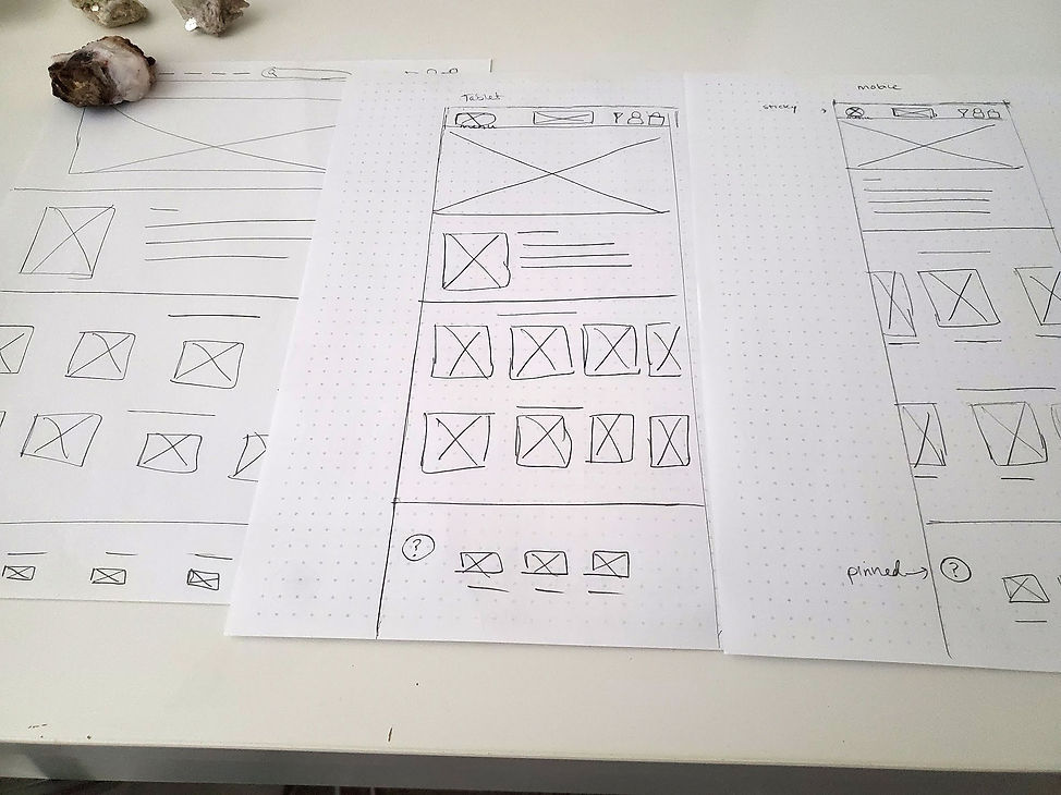
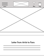
I also drafted several iterations of the home screen on pencil and paper for different screen sizes. My goal was to showcase images of the music bundles, letter to the fans, and items sold on the site as well as maintain the footer with appropriate social media icons.
Sketches
I wanted to the users to feel connected to the musician and feel in control. The filter remains in the header - as a focal point so the users can filter specific sizes and sort items price from low to high.
Digital Wireframes - filter icon


I wanted Dawn to be able to see apparel on different sized models, this format allows her to do that as well as see overall summary of the reviews about the product - maintaining a fan community.
Digital Wireframes - sizing


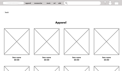
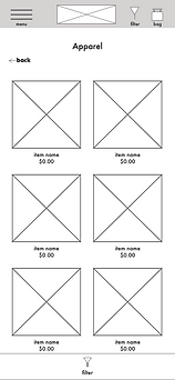
My lo-fi prototype connects the primary user flow of searching a “unisex t-shirt,” filtering it by only seeing XL and sorting price from high to low. As well as adding an art print to the cart. This way a usability study can be done on users.
Low-Fidelity Prototype - Desktop Flow


Testing
After completing my low fidelity prototype in Adobe XD I conducted a usability study on five participants. My goal of the study was figure out if my end users can seamlessly purchase a t-shirt and an art piece on the website and app. I documented the percentage of users who were able to complete their given task and used that figure as my key performance indicator.
Findings
The findings of my usability studies were:
-
Conversion rate 60%
-
Users did not recognize the symbol as a filter
-
Users were thrown off as to why it was at the top, they preferred it at the bottom of the search bar
-
Some users noticed size labeling inconsistencies that don’t align with plus size tags
Before Usability Test

filter icon unfamiliar

After Usability Test
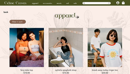
descriptive title

Users did not like the placement or the symbol of the filter option on either web or mobile so I redesigned the web version to appear below the header and as a button with the title - “filter+ sort” and when on a selected page. And for the mobile I designed it be on each respective page.
Before Usability Test

inconsistent sizing
After Usability Test

consistent sizing
Some users noticed some inconsistencies in sizes rather than going straight from XL to 2X there is also a 1X option. I adjusted for both the web and mobile.
The Final Product
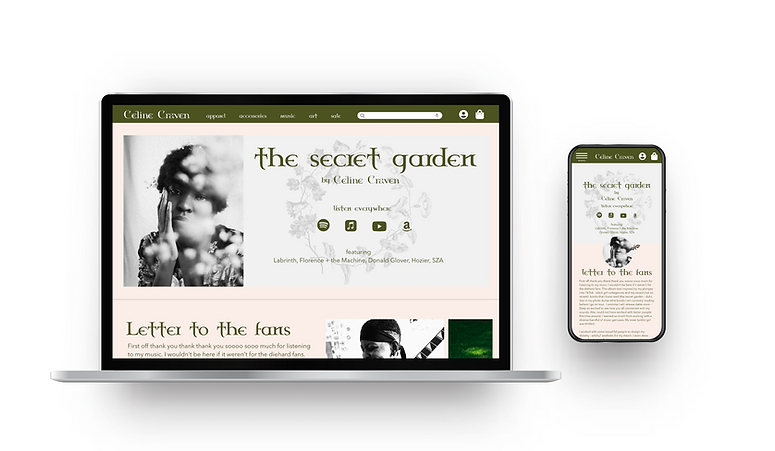
After the above iterations I completed Celine Craven's responsive website. My goal was for each device to offer the user a unique while remaining complements of one another. They have different loading pages and slightly different home pages when switching from web to mobile.


both are high - fidelity prototypes
Accessibility Considerations
I included a voice to text icon on the search bar so users are able to search items without typing. Also, I included recognizable landmarks throughout my mobile and web variations. Laslty, I used different sized headings to maintain a clear visual hierarchy.
"This experience is very unique.” - participant c
Impact
Our users really enjoyed the website and mobile experience. They felt seen and welcomed by the size inclusivity options and clear waitlist opportunities. They also appreciated the variety of graphic art selection.
My design choices
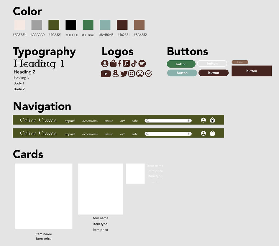
I wanted Celine's website to feel as though the users stumbled through a fairy door and discovered witchy artifacts. So my color palette were earthy neutral tones with some pops of a lighter green while also considering WCAG guidelines. I also wanted each page to have small differences to make a unique experience when the user is browsing. For instance, I constantly reorient the ladybug on each page as though it is moving on the screen.
In regards to typeface, I selected Celtic Garamond and mixed it with Glisten as the main logo to display a witchy/gothic aesthetic and for the rest of the body typeface I selected Avenir Next because it's easy to read and pairs well the other sans serif fonts.
Logo

Design system
Next Steps
If I had more time I would like to conduct more usability studies to see what other features I should include. And I would like to design a dark mode feature for both the website and mobile.

Key Takeaways
By completing this responsive website, I realized better design is familiar design with a few elements of new aspects. I failed profusely by introducing a new concept of a top filter button and learned alot from the feedback. I also learned to add some elements of fun when switching from desktop to mobile to make each experience special.
